echarts柱状图优化(柱状图渐变色实现的两种方式)
实现方式一:
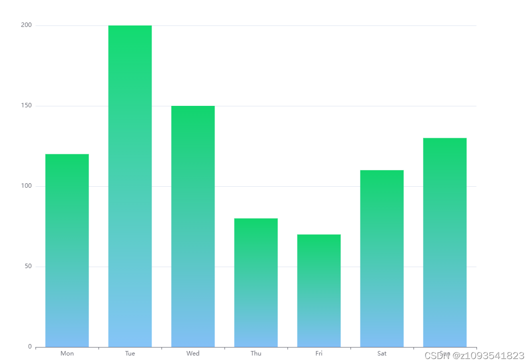
option = {
  xAxis: {
    type: 'category',
    data: ['Mon', 'Tue', 'Wed', 'Thu', 'Fri', 'Sat', 'Sun']
  },
  yAxis: {
    type: 'value'
  },
  series: [
    {
      data: [120, 200, 150, 80, 70, 110, 130],
      type: 'bar',
      color: new echarts.graphic.LinearGradient(0, 1, 0, 0, [
        {
          offset: 0,
          color: '#11d56d'
        },
        {
          offset: 1,
          color: '#83bff6'
        }
      ])
    }
  ]
};
实现方式二:
option = {
  xAxis: {
    type: 'category',
    data: ['Mon', 'Tue', 'Wed', 'Thu', 'Fri', 'Sat', 'Sun']
  },
  yAxis: {
    type: 'value'
  },
  series: [
    {
      data: [120, 200, 150, 80, 70, 110, 130],
      type: 'bar',
      color: {
        type: 'linear',
        x: 0, //右
        y: 0, //下
        x2: 0, //左
        y2: 1, //上
        colorStops: [
          {
            offset: 0,
            color: '#11d56d' // 0% 处的颜色
          },
          {
            offset: 1,
            color: '#83bff6' // 100% 处的颜色
          }
        ]
      }
    }
  ]
};
两种方式实现的效果是一样的,效果图如下